Showing posts with label my house on cook street. Show all posts

Trends on Trim Color--Which White is Right?

Friday, June 1, 2012


Last month, I posted on Choosing the Right White for trim. It’s been one of my most popular posts. I promised a follow up on which whites trend yellow and which trend gray, so here it is.
Image source

First, let me reiterate that if you have a “fixed white” in your room, for example a tile, appliance or other white feature, please choose a white that is the closest match. I made this mistake in my kitchen and regret it every day. I had always heard that White Dove (BM OC-17) was the perfect white for trim and had used it with great success time and time again. I like its creaminess versus a stark cold white. So it was a no brainer when I needed to select a white for our kitchen cabinets. Of course, I went with White Dove. (To read more on that project, clickhere.) The problem did not present itself until we were hanging the cabinet doors between the new refrigerator and stove which are also white. These new appliances (our fixed whites), had bluish-gray undertones. It became obvious, especially at night, that the whites of the new appliances were not a match for the freshly painted White Dove cabinetry. Ugh! What to do?! Buy new appliances? No. Repaint the cabinetry? No way. Live with it and hope no one notices? Yes! That’s what we’re doing, so please don’t look too closely when you come over. Can you see the difference in this picture?
Kitchen
So, lesson learned. Now we know that if we want to go with a white that has more bluish, gray cool undertones, we should lean toward a trim color like Chantilly Lace OC-65 or White Diamond OC-61. If your walls are painted in rich, deeper hues, a trim color with warm yellow undertones such as Mayonnaise OC-85 or Cream Froth OC-97 would be excellent choices.
That’s not to say that popular trim colors like White Dove or perennial favorite, Cloud White OC-130, should not be options. They’re just not the right choices EVERY time. It’s worthwhile to find the right white for trim AFTER you’ve made other color decisions on finishes, walls, etc.
Image source

If you’re feeling overwhelmed by all the options for “white”, or have trouble seeing the undertones, the best way to compare them is to put them side by side. When you have several whites together, it becomes clear right away which whites have cool vs. warm undertones as in the picture above.
If you’re still stumped, I would LOVE to help you choose the right white.


If you want to truly love where you live, please contact me about design services.

porch pretty

Thursday, January 19, 2012

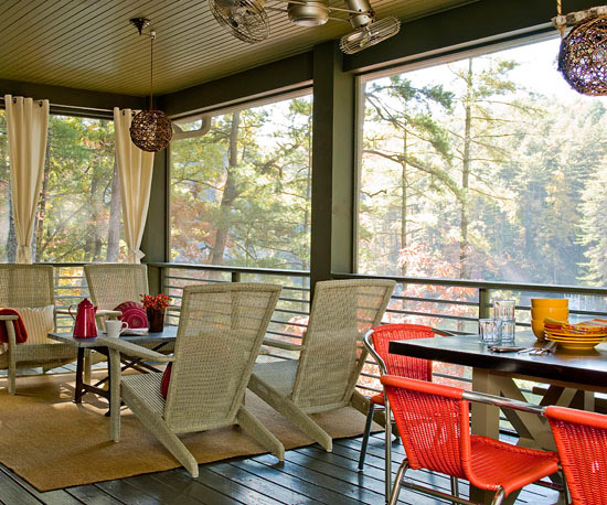
Could it have been the 65 degree day here in Denver with gorgeous bright sunshine? All that melting snow has turned my thoughts to porch sitting. There is something about a porch that’s a perfect spot for casual entertaining with good friends or sitting in solitude and peacefully enjoying the outdoor scenery. The best porches have a combination of indoor/outdoor access, great views, creative lighting with ceiling fans or dramatic pendants, cozy furniture that’s not quite outdoor durable, but close. I want it all.

We have a porch. At it’s worst, our porch has looked like this. (I realize revealing this image could be bad for business.)


It’s the old cobbler and his shoeless kids story (except my kids have a lot of shoes, bikes, sports equipment, school projects, etc. and we apparently put them all on this porch! Yikes!) This room does have potential, so sometimes I catch myself dreaming about porches that look like this…

Oh, how I adore that furniture.

Or this… We could have a nice little chat over a glass of wine in those cozy chairs.


The glossy floor and steely trim color on this porch are delish. They probably don’t allow bikes on their porch.

This porch is like hanging out in the swankiest treehouse ever.


My sheer embarrassment about the state of our porch did motivate me to do some porch prettifying last summer. I found some kitschy patio furniture at an estate sale for a steal. It was in great shape and just needed a coat of black spray paint. But the big change was using porch paint to spruce up the floor.
What do you think? Better, no?


Of course I’m not done, and this picture does not show the wall where we hang backpacks, coats, pool towels, and whatever else I can hang on a hook. However, it’s waaaaaay better, and we are motivated to take care of our porch and enjoy it more often. I have plans for more improvements next summer, but I know it will get cold again soon, so I’m not in a hurry. As it is with most projects here, to be continued…

All pretty porch pictures are from House Beautiful or Better Homes and Gardens.


If you want to truly love where you live, please contact me about design services.

bathroom remodel

Thursday, January 5, 2012

Our hallway bathroom was a blast from the past. True to its 1950′s heritage, it evoked a “love it” or “gag me” reaction from most visitors. For me, it was a little of both. I loved the vintage styling, fun color combo, laundry chute, storage, and half wall for the kids who are too busy to shut the door, yet need their privacy, please.


However, the crumbling plastic turquoise tiles, icky linoleum flooring and rubber trim (a mid-80′s upgrade?!), a tub that left you knee deep in water after a 5 minute shower, and a toilet seat with rust marks that appeared, er, questionable...this all culminated into a dire need to remodel!


Ick, that floor was gross! We took the bathroom right down to the studs. Here’s what we found under the linoleum:


More linoleum! But at least this pattern makes sense with the original yellow and turquoise tile. I’d always wondered about that. I actually kinda like it a little.Our yellow toilet found a happy home, too.

Apparently our curbside toilet disposal was an intriguing opportunity among our neighbors. When it lost its allure as a comfy reading spot, one neighbor actually put it in his pickup and drove off. I guess our trash really is someone else’s treasure.

We’re almost done with the remodel. Here are some sneak peak shots.


{This tile is like a favorite pair of jeans. It goes with anything. Love it!}


Stay tuned for the big reveal which is TBD since my finisher (read: husband) would rather ski than get this project done! Any bathroom doozies in your house? Remodels on the horizon? Do tell.


If you want to truly love where you live, please contact me about design services.


the holiday mullet

Thursday, December 1, 2011


Do you secretly wish you were married to Clark Griswold (of “Christmas Vacation” fame) when it comes to Christmas decorations but you’re worried about what your neighbors (or family!) would think? We’ve got the solution for you: the Holiday Mullet. You can have the best of both worlds with Business in the Front and PARTY (or tacky) in the back!

We LOVE cheesy holiday decorations (preferably the retro classic plastic Santa and reindeer) but fear the leers of friends and neighbors who fail to appreciate our tacky holiday fun. Thus, we came up with the Holiday Mullet where you can have a front yard with delicate white twinkle lights and fresh garland and a back yard with all the flash and bling that you really love!
Are you on board? Send us some pics of your Holiday Mullet!


If you want to truly love where you live, please contact me about design services.

kids' craft room style

Monday, May 9, 2011


I was fed up. Every night before dinner, we had to clear off the crayons, coloring books, beads, paint and other projects that my crafty peeps had been using all day. We shoved everything into a cupboard, but it all creeped back onto the dining room table the next day. I longed for a room the kids could use so we could relocate all this stuff, and it occurred to me that we had just the spot. A spooky dark unused storage room that led into our laundry room and Steve’s man cave. Unfortunately, my kids were convinced the room was haunted, so needless to say, it was not inspiring any creativity (except maybe some ghost stories). Here’s a shot of the room from our home inspection pics back in March 2008.


So armed with the cheapest supplies I could find, I was determined to make this dark dungeon into the coolest craft room in town. The first step was to prime everything. We had tons of leftover primer, so I slathered that all over the various surfaces (cement, paneling, wood closet doors, duct work). Then I got out our leftover white paint from our kitchen cabinet project and coated everything except the concrete floor. (I had other plans for that…). Here’s my helper brightening things up.


I wanted a place for the kids to easily put up artwork so we could have a rotating display. We bought a sheet of galvanized steel and nailed it into the wall and then Steve framed it for a simple display board. We used chalkboard paint on the other wall and covered the ducts above with our magnet collection. The shelves house coloring books and oversized paper.


We scored an oversized dry erase board and sawed it in half. Affordable kitchen storage from this collection houses markers, erasers, chalk and includes hooks for hanging aprons.


The other side of the room has space for a small table and chairs. I covered the seat cushions in a vinyl tablecloth so they’d be easy to clean. The table has a metal surface, so it can also take a beating.


For storage, we categorized and labeled materials in these rolling storage carts, but the most affordable storage option we found was using leftover takeout containers to corral sequins, stickers, stamps, and other project materials.


I had grand ideas about stenciling a fun pattern on the concrete floor, but the kids had their own plans. Now it has a nice lived in look.


I can’t say that we never have to clear off the dining room table at dinner time anymore. It’s almost time for dinner right now and it’s covered with newspaper, notebooks, camera, cell phone and laptop. (All evidence points to me.) But the kids aren’t afraid to go down to the craft room any more, and when their friends come over, they’re all down there for hours. And that is nice!

Foyer update: New workstation!

Tuesday, September 14, 2010

Way back in January, we made some home related resolutions. To read more about those, click here. Making our foyer more inviting was a big goal for us. We had been making some good progress with updating thebookcases and tiling the floor, but a family dilemma was starting to emerge. As our kids are all now school age, they want computer access. Steve and I both use laptops for work and are paranoid about giving the kids free reign with them. Our jalopy of a computer downstairs was no match for the demands of even the most beginner level Webkinz user. Plus, we really wanted to see what the kids were doing on the computer and shelter them from the wacky side of the world wide web. So, we decided to make a change in the foyer to accommodate a new computer for the kiddos and a family workstation we could all enjoy.
To get started, we decided that the bookcase near the kitchen would have to go. Here’s a picture of how it looked right before we removed it. 
We were hoping we’d find hardwood floor underneath. Happily we did, and then we found even more. Read about that interesting discoveryhere.
Because of Steve’s millwork connections, we were able to design a custom unit to fit our needs and space. Now, this is the view when you walk in the front door.
We love the closed upper cabinets for storage, the shelves for minimal display, and the filing cabinets for staying organized. The tall left lower cabinet houses the computer tower and has a shelf for cell phone charging. The only downside was that my former laptop workstation was now gone. My handy husband had a solution for that. He removed the copper insert from the planter on the other bookcase and covered it with a wood slab. Then, he carved out an insert where I can dump the keys, my purse and other accoutrements.
Now I still have my very own kid-free workstation. Hey, you burn more calories when you check your email standing up!

foyer update: new floor

Tuesday, June 8, 2010

Whenever I get a chance to sneak away for the weekend, I know that part of the price I’ll pay upon returning is a messy house. My husband is amazing in so many ways, but when it comes to cleaning up, I’m a team of one around here. So imagine my surprise when I returned home from a girls weekend in Virginia to find this…
Mexican Tile Floor Demo
Yep, that’s my sweet little fella playing in the residue of our former foyer floor. Boys. Must. Get. Dirty. That dust he’s sitting in was blanketing the entire first floor of our house. It wasn’t quite the mess I was expecting. Welcome home! Lovely! But was I steamed? Heck no! I couldn’t have been happier to see it go.
Once the dust settled (apparently that takes longer than a day, because the dust was settling all week), we were ready to put in some new tile. My clever husband measured out the foyer space and then used twine and tape to replicate that space on the floor of our garage.
Twine Set Up
We chose a charcoal gray porcelain tile with an organic rust effect splashing through it. The idea was to pick up the charcoal gray in our kitchen countertops and work with the golden tones in our hardwood floors.
Using the garage floor template helped us to find the best layout and determine where we (er, I mean Steve) would be making the cuts on the tile saw. Once we got the pattern right, we borrowed the kids’ sidewalk chalk to number the tiles and show how they connected to each other.
Foyer Tile w/ Chalk
Then came the messy part: cutting, mortaring, cursing. Not pretty. I took pictures and that’s about it.
Mortar Mess
The next day was Monday, and Steve had returned to the glory of his workplace so I was left to mix and apply the grout. It wasn’t so bad. Next time I’ll wear rubber gloves to protect my delicate ladylike hands, but I don’t have much wisdom to share beyond that. And after 24 hours of dry time during which the kids pretended the tiles were river stones and tip-toed over them to get to their bedrooms, we had a NEW FOYER FLOOR!
Finished Foyer Floor
Not the best picture, but hey, we’re not finished yet. Certainly without that orange and gold floor tile, our foyer is making progress on the road to fabulous.

Foyer update: glossy black paint

Friday, May 21, 2010

Last week I wrote about how I’ve been fantasizing about foyers. For a quick refresher, here’s why…no words necessary…you get the picture.
Lisa's Foyer Before
The first order of business was to remove that cracked piece of wavy and dated plexiglass that was by the planter. This was so easy, that after completing the 10 minute task, we looked at each other and wondered why we’d waited so long to do it.
Next up, we decided to update the book case and cabinet. We liked these two built-ins because they defined the foyer area and provided some extra storage for us, so we didn’t want to eliminate them all together. They just needed to be a little prettier and stylish (don’t we all?).
Light sanding removed the aged finish, and a single coat of Zissner’s Bulls Eye 1-2-3 water based primer got the built-ins paint ready.
Primed Foyer Bookcase
After two coats of Benjamin Moore Black in a semi-gloss finish, the facelift was complete. We got some stylish storage,
Living Room Bookcase After
and, I also gained a desktop that little fingers can’t reach. (It’s usually not this neat).
Foyer Bookshelf After
On the opposite side, the planter with its copper insert has become a dumping ground for keys, my purse, dog leashes, etc., but the good thing is that you can’t see this stuff unless you’re right on top of it. When we’re having company, we dump out all the junk and use it as a bar. Cheers to some progress!

Fabulous Foyers

Thursday, May 6, 2010


The foyer above has a great combination of the elements in a smaller space. Note how the wood flooring runs horizontally in the foyer and turns vertical to indicate a transition into the other room.
Do first impressions matter? Yes! No! It’s simply a matter of opinion. But the first impression someone has of your home’s interior is when they walk through your front door. You may be one who doesn’t care about first impressions, and we’re willing to bet your foyer might just reflect the same. I wish I had more of that in me, but truth be told, I think first impressions do count. I can’t help it! As a result, lately I’ve been having foyer fantasies.
Here’s why: this is our foyer. Now, honestly, what is your first impression?
our foyer
Yeah, it’s pretty bad. This picture was snapped at our home inspection, so I can’t take credit for the plastic flowers. We could see that the foyer had good bones, a closet, some shelf units that helped to define the space, and lighting. BUT, that Mexican restaurant tile! The dated plexiglass divider! The “Hello, welcome to the 80′s” front door! This poor foyer needs some design intervention!
Of course, design intervention is what I live for, so remediation is in the works. Progress reports forthcoming, I promise! In the meantime, let’s review the basic recipe for of an ideal foyer.
Essential ingredients include:
  1. lighting
  2. seating
  3. console, chest, slim table
  4. coatrack or closet
  5. mirror and/or art
  6. defined flooring
photo credit: Ngoc Minh Ngo
This bright and breezy foyer by Jonathan Adler has it all, but do you think anyone has ever worn shoes here?
image from Southern Living
This country casual entryway is much more family friendly. A bench with baskets would be the obvious choice here, so the club chairs offer unexpected comfort and whimsy.
photo credit: Andy Cheung
I love the juxtaposition of the shiny marble tile floor against the rustic bench in the foyer above. Tight and tiny, but it’s all there.
What’s happening in your foyer? Are you missing any of the essentials? Does it make an impression you can live with? Do tell!

architectural archeology

Wednesday, March 10, 2010


I truly believe in the karma of a house. I’m not saying I believe in ghosts, although if I met one I might change my mind! But without sounding too new agey, I am certain that there is an unspoken energy carried through a house by those that lived there over the years. Sometimes it’s good energy, sometimes not. It’s just a hunch, but if it feels right you may say, “Yes, this is where I want to live. Let’s do it.”
Occasionally, more tangible evidence presents itself. Often without conscious intent, previous dwellers leave clues behind that reveal who they were and when they lived in your house. Sometimes these clues are uncovered during your home inspection. Perhaps you discovered that some rumpled newspapers from 1943 had been shoved between the walls as makeshift insulation, or a box of old books were errantly left behind in the basement storage room. Maybe you’re starting a kitchen renovation and when the old cabinetry is pulled out, you find a pencil on the floor inscribed with the name of a bank that no longer exists.
Do you recognize this house? Lots of TV melodrama here!
Since choosing where to live is rather a leap of faith, it’s a pleasant surprise to discover some type of affirmation. This happened to us yesterday. We’re removing the bookshelf in our foyer to install a built in desk unit for a family workstation. Some unfinished wood was left exposed and as Steve was sanding it he found some writing on the floor.
pencil writing on our floor
From what we could read, it said “Nathaniel 1:12 Praise God, Rev. S.E. (smudged) Mississippi, September 10, 1955″
Steve thinks this goes back to the tradesmen in the apprentice system who used to travel throughout the country for work. They would sign their names to indicate to the next tradesman that this work was good enough to bear their signature.
Or perhaps it was just a lovely sentiment captured in a moment for us to discover almost 55 years later. Either way, we sanded around it, and it will remain a part of our house as it always has been.
Have you unlocked any clues about your house that you’d like to share? Do tell!

Tales of a very ugly kitchen : David vs. Goliath

Tuesday, January 26, 2010


In keeping with the original 50′s dated esthetic in the kitchen, it should come as no surprise that the ceiling light fixture looked like this…Giant florescent behemothNeedless to say, this giant florescent behemoth wasn’t flattering anybody. In the dark winter mornings it woke us up faster than a strong cup of coffee. It had to go. Easy. So we removed it, only to find this…Giant hole in the ceilingAh, yeah, perhaps not so easy. What proceeded was a multi-step, multi-day ceiling repair job. First, drywall was attached to some 2 x 4 anchors installed in the recessed areaGiant hole is patchedFollowed by several layers of drywall patch to recreate the texture of the original ceiling, and a temporary fixture in the meantime.Our new fixture, NOTAfter a week, we were ready to paint the ceiling and get the new fixture installed. We realized that with the low ceiling (sad, but true) any swanky chandelier or pretty pendants were not an option. We pored over hundreds of flushmounts, but they just didn’t spread the light around the room the way we needed. So we went with a brushed steel halogen fixture. It’s sleek stature and streamlined directional light was the right kind of luminescent muscle for us. David wins! Let there be better light!David wins

Tales of a very ugly kitchen: chalkboard paint

Thursday, December 31, 2009

I’m always a sucker for the “In” and “Out” lists that appear right around the New Year. Will skinny jeans be in? Are Uggs on their way out? (Never here in Colorado!) So I naturally was intrigued by the predictions Apartment Therapy had for the new year. Hey, if they’re declaring chalkboard paint “out”, then I’m not afraid to be behind the trends. Here’s how I used it in the kitchen. The menu keeps my shopping for the week easy, and the kids aren’t always wondering what’s for dinner. (At least the ones that can read!) 

Chalkboard paint in the kitchen