Showing posts with label design ideas. Show all posts

Nightstand Roundup

Wednesday, January 23, 2013

A nightstand truly is one of the creature comforts of modern living. It's the perfect furniture piece to collect many of your most meaningful and useful tools and trinkets. Did you know that the first nightstands were used to house (or hide!) your chamber pot? Thank goodness for indoor plumbing!

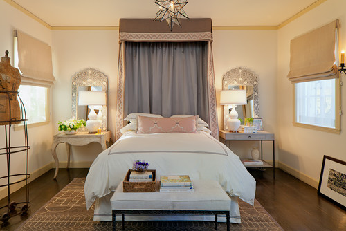
For a bedroom that gets everyday use, I recommend a nightstand with at least one drawer, so you can quickly swoop everything inside when company's coming. In a master bedroom, each sleeper needs his/her own space, but I don't think the nightstands always need to match. The room works below because the nightstands both have similar finishes and are the same height, so that the lamps and mirrors give the room a symmetrical look.


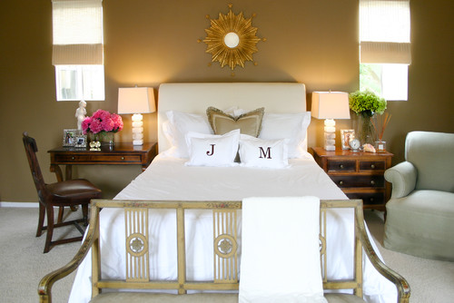
For the room below, the height is slightly off, but the color and finish of the nightstands work well together, and the matching lamps framed by the windows, pull the look off nicely.


If you're in the market for a nightstand to ease the transition into a good night's sleep, here are a few of my favorites.

{mid-century nightstand from west elm}
 For price, size and function, this mid-century nightstand from West Elm has it all.  It's got a lightweight look, clean lines and 2 drawers for easy access storage.

{park mirrored bedside table from pottery barn}
 I love the glamorous form and function of this beauty.


{zinc nightstand from restoration hardware}
 This nightstand is working the industrial chic vibe.  Bachelor pad? Teenage lair? Ladies, beware!


{tray bien from caracole}
This elegant beauty is from one of my favorite to the trade lines, and it's just so gorgeously detailed and walks the fine line between gender bias.
{portia from mitchell gold & bob williams}

Drawer pulls on this luxury number come in 2 finishes, and the sides reveal a signature red lacquer finish. Sexy!
{south seas side cart from serena & lily}
If I had a beach house, I'd want this cart for my nightstand. I love it's texture, and happy vibe.

{atwood nightstand from crate & barrel}

And for my house in the mountains, I'd choose this guy. He's got just enough rough and tumble, but still stays in line (like a good dog, or husband!)

If you'd like some help choosing the nightstand that suits you best, please contact me!

For clues to your design style, look in your closet

Wednesday, September 12, 2012


Getting dressed is easy. You do it everyday without even giving it much thought. Over time you develop a style that works for your daily life. Some of us love getting dressed up and accessorizing to the nines, and others prefer a more casual look.
image by luxemix.com
Think of your favorite outfit. The one you’re MOST comfortable in and you feel best represents YOU. What color is it? What are the textures? Is it dressy, casual or somewhere in between? Are you wearing a flowy black blouse, your favorite jeans and zippy orange flats? Are you headed to the gym in a bright pink sweatshirt? Is your look at work crisp and polished? Go to your closet. What do you see there? Solids, stripes, patterns? Neutral colors? Lots of black? A ridiculous number of jeans?
image from Real Simple
Use your fashion sense to inspire your design sense. (Even if you fear you have none, don’t worry, something internal is driving you to reach for that black turtleneck over the ruffled blouse–or vice versa!) If you’re consistently seeking neutrals in your wardrobe, then don’t force yourself to paint your walls orange! You’re not going to be happy! Trust me, I did this and I couldn't wait to paint over my orange kitchen wall. That’s not to say I wouldn’t want an orange throw pillow on my sofa. I’ve learned to work the color in as an accent, just like with the orange flats in the black blouse and jeans outfit. But that’s MY preference. If you have an orange wall that makes you happy. Keep it!
Recently, my friend said, “I’m afraid to decorate. I just like brown. I wear it, and I like it on the walls, so I don’t know what to do!” I looked at what she was wearing. She was so put together in a soft mocha sweater, crisp khakis and shiny brown leather boots. She had three shades of brown going on and three textures. Here’s how her fashion sense might translate into a room.
Thom Filicia Designer Visions Showcase
Tones of brown is all that’s happening here colorwise, but it’s the combination of textures that make it work. The shiny flooring is juxtaposed with the rough rope banister. The edgy natural wood chair/sculpture contrasts with the clean lines of the stair runner.
Another friend loves color. She’s always wearing a pale yellow fleece or a hot pink hoodie. She thinks she isn’t fashionable because she’s pairing these with the ubiquitous black workout pants, but we disagree. She likes color in her house too. Pale yellows and greens, and deep rich blues. Her favorite room might look something like this.
image from calicocorners.com
The long-winded point here is don’t force yourself into decor that’s not you. Trust your instincts and look to the style you already possess to direct your design sense. If you’re a neutral girl, embrace it and throw in a patterned pillow that won’t break the bank if you tire of the color splash. If you crave color and pattern, swathe your surroundings in it. If you are drawn to fur collars and cheetah prints, work those textures and patterns into your decor. Your home should be your comfort zone, so make it a reflection of you.


If you want to truly love where you live, please contact me about design services.

Trends on Trim Color--Which White is Right?

Friday, June 1, 2012


Last month, I posted on Choosing the Right White for trim. It’s been one of my most popular posts. I promised a follow up on which whites trend yellow and which trend gray, so here it is.
Image source

First, let me reiterate that if you have a “fixed white” in your room, for example a tile, appliance or other white feature, please choose a white that is the closest match. I made this mistake in my kitchen and regret it every day. I had always heard that White Dove (BM OC-17) was the perfect white for trim and had used it with great success time and time again. I like its creaminess versus a stark cold white. So it was a no brainer when I needed to select a white for our kitchen cabinets. Of course, I went with White Dove. (To read more on that project, clickhere.) The problem did not present itself until we were hanging the cabinet doors between the new refrigerator and stove which are also white. These new appliances (our fixed whites), had bluish-gray undertones. It became obvious, especially at night, that the whites of the new appliances were not a match for the freshly painted White Dove cabinetry. Ugh! What to do?! Buy new appliances? No. Repaint the cabinetry? No way. Live with it and hope no one notices? Yes! That’s what we’re doing, so please don’t look too closely when you come over. Can you see the difference in this picture?
Kitchen
So, lesson learned. Now we know that if we want to go with a white that has more bluish, gray cool undertones, we should lean toward a trim color like Chantilly Lace OC-65 or White Diamond OC-61. If your walls are painted in rich, deeper hues, a trim color with warm yellow undertones such as Mayonnaise OC-85 or Cream Froth OC-97 would be excellent choices.
That’s not to say that popular trim colors like White Dove or perennial favorite, Cloud White OC-130, should not be options. They’re just not the right choices EVERY time. It’s worthwhile to find the right white for trim AFTER you’ve made other color decisions on finishes, walls, etc.
Image source

If you’re feeling overwhelmed by all the options for “white”, or have trouble seeing the undertones, the best way to compare them is to put them side by side. When you have several whites together, it becomes clear right away which whites have cool vs. warm undertones as in the picture above.
If you’re still stumped, I would LOVE to help you choose the right white.


If you want to truly love where you live, please contact me about design services.

Choosing the "Right White" for trim

Tuesday, April 10, 2012


First, let me say that the idea for this post comes as I gaze upon my orangey gold 1950′s era trim with derision. I would LOVE to paint it white, but my husband is a trim snob. He says that our trim’s singular redeeming attribute (and that’s a stretch, my hunky husband), is that it’s maybe some type of African mahogany. Sure, whatever. To me it’s just orangey gold, skinny and whimpy. I lust for chunky white trim and solid six pack –errr, I mean six panel doors. And if I was to be so lucky, here’s how I’d choose the right white paint for it all.
Choosing the right white can be a little daunting. I’ve certainly made the mistake a few times. The Benjamin Moore fan deck has over 100 whites with tints ranging from red, orange, yellow, green, blue, purple and gray. But for trim, the reason you are choosing white is for the contrast with your wall color, so it’s best to stick with the creamier whites (the ones with the yellow undertones), or the cooler whites (with grayer undertones). Still it can be tricky. The trim in the photo below looks cooler to me. What do you think?
Photo: Antoine Bootz
Confused yet? Don’t be! The first step to take is to look around you to see if a white color already exists in your space. This is called a “fixed” white, and it could be your kitchen cabinets, or bathroom tile, or even an appliance, such as a refrigerator. It’s important to work with this fixed white. If your kitchen cabinets are a bright white, then you’ll want the closest match for your trim color. If your white bathroom tile has creamier tones, then you’ll want to go towards a white with a yellow tint.
Photo: Restoration Hardware
If you don’t have any “fixed” white colors, then your best bet is to save your trim color choice for last. Once you have selected your color palette, then you can look to those colors to determine whether you should go for a creamy white or a cooler white. If you’ve selected rich colors, a creamier white trim might soften the contrast, whereas a bright white trim might look too harsh. If you’ve chosen a popular color like Silver Sage, then a crisp white would be the right choice for the trim.
Photo: Jeremy Samuelson for Cottage Living
Stay tuned for a tutorial on the best way to “read” your whites to determine which ones trend creamy and which trend cool and crisp.


If you want to truly love where you live, please contact me about design services.

Bathroom Glamour

Thursday, March 29, 2012


This bathroom had me at “Hello…Yellow.”
Yellow Bathroom
I discovered it at the home of our friends, Bill & Shirli. Their house is filled with gobs of creative energy, whimsical art, eclectic furnishings, and a friendly floor plan. Then it’s doused with the high octane levels of four kids and a collection of dogs and cats running about. To my kids, it’s a slice of heaven. To me, this bathroom is.
Yellow Bathroom
Bill, an avid DIYer, crafted the clean-lined black mirror frame and base cabinetry. Isn’t is cool how the  chunky white vessel sink cantilevers over the cabinets below?
The real show stopper for me is the wallpaper. The flowery plumes and the way the yellow pops against the black and white elements in the room bring a fluid and energetic vibe to the space.
Wallpaper
It’s the perfect glam pit stop in this house of fun.


If you want to truly love where you live, please contact me about design services.

Decorate in stages

Tuesday, August 2, 2011


Ever since I started decorating for pay and blogging about the topic, I've been slightly paranoid about my home. I'm worried people will walk in and expect perfectly appointed rooms, styled just right without a dog hair or pile of school papers in sight. I do have visions of how it should be, but time and money seem to make it impossible to pull it all together today! Is that true for you too?
So to make us all feel better, let’s get a little perspective and break this down into smaller stages. At each stage, the goal is for a room to look and function well. To illustrate, we found images of  a family friendly living room with great potential.
Stage 1: This room is overly neutral, but has the makings of a great space: a cozy sectional, a nook for office space, and great architectural details like the French doors that open to the foyer and the fireplace.
Image from bhg.com
Image from bhg.com
Image from bhg.com
Image from bhg.com
Stage 2: With the addition of some fun striped drapery panels, a color palette is emerging. The round table formerly in the office nook is now replaced by a more functional desk. The table now finds its home the opposite corner. A rug anchors the seating area, and some whimsical accessories liven up the mantle.
Image from bhg.com
Image from bhg.com
Image from bhg.com
Image from bhg.com
Stage 3: Now, some of you may be thinking, “Stick a fork in it; this room is done!” But watch what happens when new paint is splashed on the walls, and some new furniture pieces are acquired.
Image from bhg.com
Image from bhg.com
The pale blue color on the walls makes the formerly boring beige sectional really pop now. Additional throw pillows bring some new patterns into the room.
Image from bhg.com
Image from bhg.com
The office nook now sports a custom desk and bountiful concealed storage. The pumpkin color on the wall differentiates the area, but still works well with the blue on the surrounding walls.

Image from bhg.com
Image from bhg.com

A new coffee table and TV stand have been added, and the former TV stand now functions as a console behind the couch with storage for games and other family room essentials.
Hopefully you’re now breathing a sigh of relief. It’s great to walk into a room that’s “done”, but for most of us, decorating is a process. So take your time, change your mind, stop and start; do it in stages. That's my plan on the homefront, too.


If you want to truly love where you live, please contact me about design services.

Keep a design diary

Friday, March 25, 2011


Ever find yourself fingering a new towel set or enchanted by lovely drapery panels when you’re out and about, only to wish you could remember the exact shade of blue you’d painted that bathroom? Returns are no fun, and you never know when you’ll stumble on that well-priced must have item. Should you pull the trigger or not? Dilemma solved. Start a Design Diary for your home.
Image from seejanework.com
It’s an easy practice to start. Pick up a purse (diaper bag, backpack, small suitcase, whatever you’re carrying these days) sized notebook. We like these from See Jane Work.
In your diary you can designate a few pages for each room. Make a list of the items you’re searching for (window treatments, art, towels, bedspreads, lamps, furniture, accessories, etc.). If you’ve painted already and are happy with the outcome, tape the paint chip from the paint store right on the page. Staple in any fabric swatches. (No one will ever notice the small cut from your dust ruffle!) You can also attach pictures from magazines and catalogs that inspire you. That way, when you find yourself at HomeGoods with only 10 minutes to spare before your lunch hour is over or you need to pick up the kids, you can consult your design diary to determine whether that bath mat you’re contemplating will work with your colors, and whether you actually NEED it.
You can also use your design diary as a record for work you’ve had done in your home, and as a place to collect business cards from quality contractors whom you’d like to call again should the need arise.
It’s easy to tailor this concept to your home’s design needs, but making it portable is key. When you have it at the ready, you can avoid the whole “seemed like a good idea at the time” kind of buyer’s remorse that sends you straight back to the returns lane.

style your bookshelf

Tuesday, March 15, 2011


For a recent client, I recommended that she pare down from two domineering bookshelves in her living room to one with a less imposing design. Editing her book collection and then restyling the new bookshelf seemed like a daunting task to her, but it’s really not so hard if you follow these simple steps.
Edit down your collection
Remove everything from your shelves and start sorting. Sell, donate, or recycle any popular fiction, cookbooks, business or reference guides and children’s books that are either outdated, unused, or damaged.
Keep your prized possessions
old books
Hold on to any books that have sentimental value to you. I have an old copy of Gone With The Wind that my grandmother gave her father for Christmas in 1936, for example; it’s a keeper. A book may have real value if it’s been signed by the author so you’ll want to keep it for sure. Also, hang on to any children’s books written before World War II because they're valuable too. Ultimately, it’s your space, and you’re the one who will be looking at the shelves most often, so keep the books that mean the most to you and reflect you and your family.
Find your shelving style
Once you’ve determined your keepers, you have lots of options with how to display them. Keep in mind, there is no right way to do this, just work it until it feels right to you. Some ways to consider are to group by color, size, or subject matter.
Image source
Image courtesy of colourlovers.com
You can shelve your books by varying the heights to achieve a skyline look. You can stack them horizontally; this works especially well for heavy hardcovers on lower shelves. Or, you can go for the traditional staircase style.
Add some accessories
Scour around for some objects that could be used as unexpected bookends. Choose other items you have to showcase–small vases, decorative boxes, picture frames, objects from nature–and work them in so that the sizing of the objects is in proportion. A small vase with a single flower looks great placed on an oversized hardcover book.
How to shelve your books
Make it work for YOUR home
How to arrange your bookshelves
Designate a basket of children’s books on a lower shelf to keep that often messy hodge-podge looking stylish and accessible. Lean a painting or framed photo on the back of the shelf for a simple and elegant look. Most of all, make it work for your family. And if you get bored with the look, it’s one of the easiest and cheapest things to makeover next week!

reuse your holiday scraps

Friday, December 17, 2010

Image courtesy of Kelly Wilkinson
{Image courtesy of Kelly Wilkinson}

About this time of the holiday season I find myself surrounded by piles, rolls, and heaps of discarded wrapping paper. I save the cast offs in the hopes that the perfect little bauble box might find it’s way into my to-be-wrapped pile–a pile which seems to multiply at night while the sugarplums are dancing merrily in my slumber. Somehow that little box never materializes, and I’m left to ponder whether to fetch the recycling bin or shove the scraps back into the holiday wrapping storage bin. But today, right here in my inbox, is a nifty little craft project that uses recycled holiday paper, or any paper for that matter, for a simple, stylish and festive decor idea. It comes from Kelly Wilkinson who is a contributor at The Washington Post (which publishes one of my favorite regional home and garden sections). Check out Kelly’s clever crafty blog at makegrowgather.com, and read on to learn how to make this holiday garland step-by-step.

Fabulous Foyers

Thursday, May 6, 2010


The foyer above has a great combination of the elements in a smaller space. Note how the wood flooring runs horizontally in the foyer and turns vertical to indicate a transition into the other room.
Do first impressions matter? Yes! No! It’s simply a matter of opinion. But the first impression someone has of your home’s interior is when they walk through your front door. You may be one who doesn’t care about first impressions, and we’re willing to bet your foyer might just reflect the same. I wish I had more of that in me, but truth be told, I think first impressions do count. I can’t help it! As a result, lately I’ve been having foyer fantasies.
Here’s why: this is our foyer. Now, honestly, what is your first impression?
our foyer
Yeah, it’s pretty bad. This picture was snapped at our home inspection, so I can’t take credit for the plastic flowers. We could see that the foyer had good bones, a closet, some shelf units that helped to define the space, and lighting. BUT, that Mexican restaurant tile! The dated plexiglass divider! The “Hello, welcome to the 80′s” front door! This poor foyer needs some design intervention!
Of course, design intervention is what I live for, so remediation is in the works. Progress reports forthcoming, I promise! In the meantime, let’s review the basic recipe for of an ideal foyer.
Essential ingredients include:
  1. lighting
  2. seating
  3. console, chest, slim table
  4. coatrack or closet
  5. mirror and/or art
  6. defined flooring
photo credit: Ngoc Minh Ngo
This bright and breezy foyer by Jonathan Adler has it all, but do you think anyone has ever worn shoes here?
image from Southern Living
This country casual entryway is much more family friendly. A bench with baskets would be the obvious choice here, so the club chairs offer unexpected comfort and whimsy.
photo credit: Andy Cheung
I love the juxtaposition of the shiny marble tile floor against the rustic bench in the foyer above. Tight and tiny, but it’s all there.
What’s happening in your foyer? Are you missing any of the essentials? Does it make an impression you can live with? Do tell!

Melamine--is it time for Spring?

Tuesday, April 6, 2010


For some it’s that first robin sighting, for others it’s the daffodils and forsythia that are blooming, for us it’s the abundance of melamine dishes we’re spotting that is signaling warmer days ahead. Melamine is a resin material that is shatterproof and inexpensive. Translation: you have permission to splurge on some affordable and fun new dishes. They’re durable and casual; just like the perfect backyard party guest! Just remember to keep them out of the microwave and oven. Here are some of the season’s best…
This sophisticated set evokes the look of Turkish pottery.
Iznik Melamine Collection-Williams-Sonoma Home
This classic grovestand design would mix ‘n match well with other solid dishes.
Summer Fruit Melamine Dinnerware - Bed Bath & BeyondWe dig the bold modern graphics on this hip dinnerware collection.
Melamine Dinnerware - West Elm
Save 20% and receive free shipping on this colorful collection by entering TABLETOP at checkout.
Isis Dinnerware - Horchow
This last playful set celebrates the flora and fauna of summer.
Acapulco Dinnerware - Neiman Marcus
So as the weather warms, go ahead and invite the gang over for some backyard grilling, chilling and pretty plate filling. Delish!

Pantone color of 2010

Saturday, February 13, 2010


Apparently we’re not the only ones happy that 2009 is behind us. Now Pantone, the global authority on color (according to them!), has also determined that we need a soothing color to heal us from the ills we suffered last year. Their pick for 2010? Turquoise.
turquoise-pantone
Combining the serene qualities of blue and the invigorating aspects of green, Turquoise evokes thoughts of soothing, tropical waters and a languorous, effective escape from the everyday troubles of the world, while at the same time restoring our sense of wellbeing. – Pantone
Pantone predicts this color will be significantly evident in the fashion and home decor trends we see unfold in 2010.
Image courtesy of housebeautiful.com
Since Glad That Year Is Over does not appear in the Pantone fan deck, we can look to Turquoise to cure us from our 2009 hangover. And for that year long headache, you could blame Pantone. Their choice for color of 2009? Mimosa!

unconventional curtains

Tuesday, January 12, 2010

Ok, so this isn’t really a craft, but the idea is simple, cheap and easy. The other day I was at my dear friend, Betsy’s, and as I was washing up in the loo, I noticed her clever little cafe curtains. They’re tea towels, and they look so cute and colorful, and so ORIGINAL in her cottagey white bathroom.  Her mom picked them up at a flea market. Don’t you just love the subtle wine bottle motif?


I love the idea of making curtains out of something else. My current kitchen valance is a table runner I picked up at Cost Plus. No sewing necessary! Love it.


Have you seen any unconventional curtains lately? Do tell.