Showing posts with label design musings. Show all posts

Pantone's Color of the Year: Emerald Green

Wednesday, January 16, 2013

As far as trends go, I'm usually a few steps behind, so here I am now reporting last week's big announcement.  This year's color of the year from Pantone is EMERALD GREEN.


“Green is the most abundant hue in nature – the human eye sees more green than any other color in the spectrum,” said Leatrice Eiseman, executive director of the Pantone Color Institute®. “As it has throughout history, multifaceted Emerald continues to sparkle and fascinate. Symbolically, Emerald brings a sense of clarity, renewal and rejuvenation, which is so important in today’s complex world. This powerful and universally appealing tone translates easily to both fashion and home interiors."

I love how the idea of green has so many layers of meaning.  On the kinder gentler side, green can be a way of life, a way to embrace nature and a lifestyle intended to honor it. On the flipside, there's no denying that green is the color of money. Greenbacks anyone? So it makes sense that GREEN has a universal appeal.

Trend setting aside, take a look at some fun ways to add the shade into (or outside) your home this year.
{source}
No fear of commitment here. I love the glossy finish on these green subway tiles, as well as the variation in the positioning that frames the sink.


{source}

A front door doesn't have to be a long term commitment. That's the type of trend I like to follow.

{source}
Bright pops of color in an otherwise neutral space seems to be rather popular as of late.

{source}
Here's a very doable DIY project that reinvents and transforms an antique into a modern, functional piece. Rather "green" don't you think?

{source}
Would my daughters stop fighting about sharing a room if it looked like this? If only, but I do love the height and luxe factor on these headboards.

{source}
If this bedroom is too over the top for you, then consider these simple ideas to keep you on trend without overextending your green.

{source}

If you'd like to incorporate your favorite color into your home, please contact me. I'd love to help!


back in brass

Tuesday, October 30, 2012

A year or two ago I would have groaned if I knew that brass would be making a comeback. The image of the ubiquitous builder grade chandelier comes to mind...

It takes me back to the 80's like the AC/DC song that this post's title has pumped into my head.

But lately, I'm seeing the most beautiful variations on the brass theme. Instead of the builders' brass chandelier, what about something like this?

Source: houzz.com via Lisa on Pinterest

Source: houzz.com via Lisa on Pinterest


The October 2012 issue of Real Simple features this room on the cover...
Source: google.com via Lisa on Pinterest

The fixtures above have a more contemporary design to them, but the brass equalizes the modernity in a way that gives it a more classic esthetic. These two pendants would scream contemporary in a chrome finish, but they seem more earthy and interesting in brass.
Source: houzz.com via Lisa on Pinterest

I'm finding a lot of brass in furniture like this classic and timeless brass bed...


Source: houzz.com via Lisa on Pinterest


Source: houzz.com via Lisa on Pinterest

and in plumbing fixtures...
Source: houzz.com via Lisa on Pinterest

I love how the modern lines and warm patina of the faucet fixture above soften the cool carrera marble backsplash behind it.

If you're not ready to fully jump on the brass bandwagon as in this bathroom here (but how fun!)

Source: houzz.com via Lisa on Pinterest

Maybe you would possibly consider a mild flirtation. Why not try mixing in an accent lamp?
Source: amazon.com via Lisa on Pinterest

Or say hello to this little cutie.

So is brass back for you? Do tell.


If you want to truly love where you live, please contact me about design services.


for an ugly brick fix -- is paint a go, or a no?

Friday, October 19, 2012

In my 'hood almost every home is brick. But they are bricks of a different color.

You've got the charming and classic red brick...


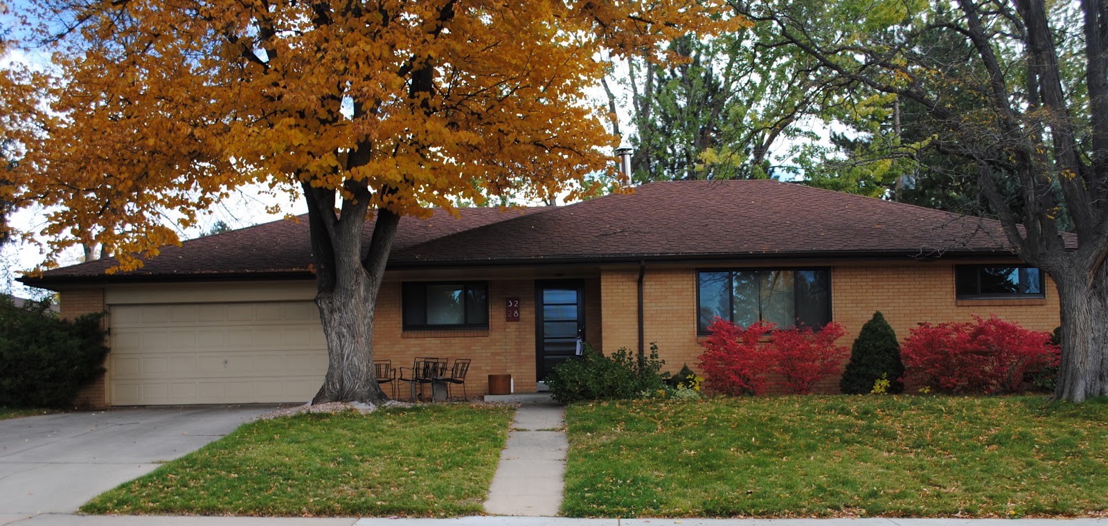
The beigey brick ...


The yellow brick...


Or even orangey brick...


And all these houses wear their colors well in my opinion. I wish I could show you a house of powder puff pink brick a block away, but it just turned over, and guess what the new owners did? Yep, they painted it gray. I can't blame them. Who'd want to live in the "pink house"? Okay, maybe my 2 year old niece, but she's not paying the mortgage.

It really seems like a lot of the neighbors are going for paint on the brick. It's a no brainer if it's already painted, but taking that leap is a long term commitment. And everyone has an opinion about whether it's a good idea.

One of my neighborhood clients (and friend), just bought a house with an orangey tone brick. This orange (which she detested) was, shall we say "enhanced in its orangeyness" by a terra cotta trim on the windows, gutters, and fascia. We talked a lot about how we could tone down the orange in the brick with a different trim color, and she was convinced, albeit reluctantly not to paint the brick.  BUT, she just really hated the brick. It kept needling her. I kind of wanted to go for painting it too, but we kept hearing, "It's bad for the brick." We both were having dreams like this.


Source: google.com via Lisa on Pinterest


I did a little research, and came up with some interesting information. "Painting brick can be tricky because brick is porous, especially if it’s older brick. Porous brick absorbs water, so you need to give the moisture a way to evaporate. If you cover the brick with paint that blocks moisture, ice crystals may form within the brick in cold weather, causing spalling. A cement-based coating is the safest paint for exterior brick, says Chip Clark, vice president of engineering services for the Brick Industry Association, a trade group. He recommends against all-acrylic house paint for exterior brick." (read full article here)

Now that's good information, but we quickly learned that almost any opinion could be substantiated by someone advocating for their position. Rather political, eh? Ultimately, the following is the advice we heeded, frankly because it was what we wanted to hear. "Painting a brick exterior on a house can be a time consuming job, but the results are often worth the effort. Some people adamantly feel that exterior brick should not be painted with house paint, while others enjoy the aesthetic look of exterior paint on brick. Painting exterior brick is a choice that comes down to personal preference, functional need and style. It's ideal to paint over a brick exterior when it is damaged or unsightly." (read full article here)  The plain truth is that my client and I both found her brick "unsightly" and that gave us the permission we needed to proceed.

So paint the brick she did, and we are all thrilled. It looks amazing. I almost drove right by the house the first time I visited. WHAT a difference!


{The AFTER shot.  Their 3 square lite front door is now a glossy black. Very hip.}


If you want to truly love where you live, please contact me about design services.

get the rug right

Monday, October 8, 2012

Many designers start with the rug, and work their way up in a room. The rug can define the palette, or calm it down. It can provide presence with texture without adding much color at all.

I think it’s okay to think of your rug as an investment piece, much like art, if you know you’re going for quality and longevity. But you also have to consider how it’s being used. If it’s going to serve as your runner by the front door, spare the expense and get a hip indoor/outdoor rug like this one.

Always a sucker for the chevron lately. Will I love it as much in five years? I’m not sure, but at this price I know I’ll be happy for at least three! Lately, I’m loving the look of a simple graphic pattern with a workable palette…


Source: surya.com via Lisa on Pinterest

For a recent family room makeover, we’ve selected this rug. It’s providing us with the most beautiful palette inspiration for the rest of the room. I’m excited to see how it all comes together.
Source: surya.com via Lisa on Pinterest

What are your thoughts on rugs? Do you like to play it safe? Would you pony up for a real gem? I’d love to know…


If you want to truly love where you live, please contact me about design services.

For clues to your design style, look in your closet

Wednesday, September 12, 2012


Getting dressed is easy. You do it everyday without even giving it much thought. Over time you develop a style that works for your daily life. Some of us love getting dressed up and accessorizing to the nines, and others prefer a more casual look.
image by luxemix.com
Think of your favorite outfit. The one you’re MOST comfortable in and you feel best represents YOU. What color is it? What are the textures? Is it dressy, casual or somewhere in between? Are you wearing a flowy black blouse, your favorite jeans and zippy orange flats? Are you headed to the gym in a bright pink sweatshirt? Is your look at work crisp and polished? Go to your closet. What do you see there? Solids, stripes, patterns? Neutral colors? Lots of black? A ridiculous number of jeans?
image from Real Simple
Use your fashion sense to inspire your design sense. (Even if you fear you have none, don’t worry, something internal is driving you to reach for that black turtleneck over the ruffled blouse–or vice versa!) If you’re consistently seeking neutrals in your wardrobe, then don’t force yourself to paint your walls orange! You’re not going to be happy! Trust me, I did this and I couldn't wait to paint over my orange kitchen wall. That’s not to say I wouldn’t want an orange throw pillow on my sofa. I’ve learned to work the color in as an accent, just like with the orange flats in the black blouse and jeans outfit. But that’s MY preference. If you have an orange wall that makes you happy. Keep it!
Recently, my friend said, “I’m afraid to decorate. I just like brown. I wear it, and I like it on the walls, so I don’t know what to do!” I looked at what she was wearing. She was so put together in a soft mocha sweater, crisp khakis and shiny brown leather boots. She had three shades of brown going on and three textures. Here’s how her fashion sense might translate into a room.
Thom Filicia Designer Visions Showcase
Tones of brown is all that’s happening here colorwise, but it’s the combination of textures that make it work. The shiny flooring is juxtaposed with the rough rope banister. The edgy natural wood chair/sculpture contrasts with the clean lines of the stair runner.
Another friend loves color. She’s always wearing a pale yellow fleece or a hot pink hoodie. She thinks she isn’t fashionable because she’s pairing these with the ubiquitous black workout pants, but we disagree. She likes color in her house too. Pale yellows and greens, and deep rich blues. Her favorite room might look something like this.
image from calicocorners.com
The long-winded point here is don’t force yourself into decor that’s not you. Trust your instincts and look to the style you already possess to direct your design sense. If you’re a neutral girl, embrace it and throw in a patterned pillow that won’t break the bank if you tire of the color splash. If you crave color and pattern, swathe your surroundings in it. If you are drawn to fur collars and cheetah prints, work those textures and patterns into your decor. Your home should be your comfort zone, so make it a reflection of you.


If you want to truly love where you live, please contact me about design services.

Do you have A.D.D (&D.)?

Thursday, August 30, 2012


Come on, you know you love those Cosmo and Glamour quizzes about how to please your man. Now, take this quick (and innuendo free) quiz to see if you, too, suffer from the affliction we know as A.D.D.(D.)
1. If you found a $100 bill on the street, you would indulge yourself with
  • a) a bonus contribution to your 401K.
  • b) that pair of shoes you’ve been coveting.
  • c) new throw pillows for your sofa.
2. It’s a great day for mail when you receive
  • a) your tax refund.
  • b) an invitation to a bash. (Hmm… not an evite, must be a wedding!)
  • c) the latest issue of House Beautiful.
3. Your perfect pre-dawn morning is
  • a) a 5:30 am spin class.
  • b) Pre-dawn? Never heard of it.
  • c) everyone else sleeping, steaming cup of coffee, and your DVRed episodes of Candice Tells All and Sarah 101.
4. Your ideal Saturday is spent
  • a) carving fresh powder.
  • b) sleeping in, with a high noon rally for Starbucks.
  • c) on a road trip to IKEA.
5. You find yourself at an antiques market, you
  • a) look fervently for the nearest fried dough vendor.
  • b) are mesmerized by the jewelry and drop $20 on an antique brooch.
  • c) contemplate renting a trailer for all of the loot you want to bring home.
6. The website you visit daily for eye candy is
Tally your score by giving yourself 1 point for your A answers, 2 points for B answers, and 3 points for C answers.
If you scored 6- 10 points, you’re all set for your retirement, have a sweet pad in Aspen and a nice tight butt. (We’re kinda jealous.)
If you scored 11-14 points you wish you were a celebrity, have a killer wardrobe and a busy social calendar. (We’re kinda jealous, especially of the amount of sleep you get.)
If you scored 15-18 points, girl (or dude), you’ve got it bad. You suffer from A.D.D.(D.) which is known in the psychiatric shelter journals as Always. Dreaming. (of) Decorating. (Disorder.) You probably spent last night dreaming that your family room would look much better with a fresh coat of paint, new coffee table and window treatments. (It would.)
Image courtesy of myhomeideas.com
You’re sure you could get a lot more accomplished if your home office looked like this. (You could.)
Image courtesy of Southern Living
And your laundry would practically do itself if this was your laundry room. (It’s a proven fact.)
Image courtesy of Cottage Living
Don’t worry, you’re in good company. We’ve got it bad too.


If you want to truly love where you live, please contact me about design services.

living room zones

Thursday, August 16, 2012

I have a new client with a big new living room addition. There are a few focal points (fireplace, tv), and some pathways to contend with...from the front foyer to the outside back, and then a separate one to the mudroom/ so I've been thinking a lot about creating zones within a big space. Here's a pretty traditional variation on that theme with the wingback chairs in the corner ready for a private chat or quiet moment.
Source: bhg.com via Lisa on Pinterest

I love how the chaise functions as a kind of room divider in this room. The picture hints at 2 seating areas.
Source: houzz.com via Lisa on Pinterest

This chaise design also functions as low profile seating, so it defines the space in the room below, but doesn't block it visually the way the back of a sofa might. I think it's a more inviting look.

I'd love to be at a cocktail party in this room. Can't you just see a group of ladies whispering on the curvaceous banquette in the corner? It's such a cozy and inviting use of that space, and having two seating zones does make this room appear to live larger.

I like the idea of the unexpected seating option...chaise or banquette...to offer more zones in a room. Lots to think about. I'll keep you posted.


If you want to truly love where you live, please contact me about design services.

Trends on Trim Color--Which White is Right?

Friday, June 1, 2012


Last month, I posted on Choosing the Right White for trim. It’s been one of my most popular posts. I promised a follow up on which whites trend yellow and which trend gray, so here it is.
Image source

First, let me reiterate that if you have a “fixed white” in your room, for example a tile, appliance or other white feature, please choose a white that is the closest match. I made this mistake in my kitchen and regret it every day. I had always heard that White Dove (BM OC-17) was the perfect white for trim and had used it with great success time and time again. I like its creaminess versus a stark cold white. So it was a no brainer when I needed to select a white for our kitchen cabinets. Of course, I went with White Dove. (To read more on that project, clickhere.) The problem did not present itself until we were hanging the cabinet doors between the new refrigerator and stove which are also white. These new appliances (our fixed whites), had bluish-gray undertones. It became obvious, especially at night, that the whites of the new appliances were not a match for the freshly painted White Dove cabinetry. Ugh! What to do?! Buy new appliances? No. Repaint the cabinetry? No way. Live with it and hope no one notices? Yes! That’s what we’re doing, so please don’t look too closely when you come over. Can you see the difference in this picture?
Kitchen
So, lesson learned. Now we know that if we want to go with a white that has more bluish, gray cool undertones, we should lean toward a trim color like Chantilly Lace OC-65 or White Diamond OC-61. If your walls are painted in rich, deeper hues, a trim color with warm yellow undertones such as Mayonnaise OC-85 or Cream Froth OC-97 would be excellent choices.
That’s not to say that popular trim colors like White Dove or perennial favorite, Cloud White OC-130, should not be options. They’re just not the right choices EVERY time. It’s worthwhile to find the right white for trim AFTER you’ve made other color decisions on finishes, walls, etc.
Image source

If you’re feeling overwhelmed by all the options for “white”, or have trouble seeing the undertones, the best way to compare them is to put them side by side. When you have several whites together, it becomes clear right away which whites have cool vs. warm undertones as in the picture above.
If you’re still stumped, I would LOVE to help you choose the right white.


If you want to truly love where you live, please contact me about design services.

Choosing the "Right White" for trim

Tuesday, April 10, 2012


First, let me say that the idea for this post comes as I gaze upon my orangey gold 1950′s era trim with derision. I would LOVE to paint it white, but my husband is a trim snob. He says that our trim’s singular redeeming attribute (and that’s a stretch, my hunky husband), is that it’s maybe some type of African mahogany. Sure, whatever. To me it’s just orangey gold, skinny and whimpy. I lust for chunky white trim and solid six pack –errr, I mean six panel doors. And if I was to be so lucky, here’s how I’d choose the right white paint for it all.
Choosing the right white can be a little daunting. I’ve certainly made the mistake a few times. The Benjamin Moore fan deck has over 100 whites with tints ranging from red, orange, yellow, green, blue, purple and gray. But for trim, the reason you are choosing white is for the contrast with your wall color, so it’s best to stick with the creamier whites (the ones with the yellow undertones), or the cooler whites (with grayer undertones). Still it can be tricky. The trim in the photo below looks cooler to me. What do you think?
Photo: Antoine Bootz
Confused yet? Don’t be! The first step to take is to look around you to see if a white color already exists in your space. This is called a “fixed” white, and it could be your kitchen cabinets, or bathroom tile, or even an appliance, such as a refrigerator. It’s important to work with this fixed white. If your kitchen cabinets are a bright white, then you’ll want the closest match for your trim color. If your white bathroom tile has creamier tones, then you’ll want to go towards a white with a yellow tint.
Photo: Restoration Hardware
If you don’t have any “fixed” white colors, then your best bet is to save your trim color choice for last. Once you have selected your color palette, then you can look to those colors to determine whether you should go for a creamy white or a cooler white. If you’ve selected rich colors, a creamier white trim might soften the contrast, whereas a bright white trim might look too harsh. If you’ve chosen a popular color like Silver Sage, then a crisp white would be the right choice for the trim.
Photo: Jeremy Samuelson for Cottage Living
Stay tuned for a tutorial on the best way to “read” your whites to determine which ones trend creamy and which trend cool and crisp.


If you want to truly love where you live, please contact me about design services.