back in brass

Tuesday, October 30, 2012

A year or two ago I would have groaned if I knew that brass would be making a comeback. The image of the ubiquitous builder grade chandelier comes to mind...

It takes me back to the 80's like the AC/DC song that this post's title has pumped into my head.

But lately, I'm seeing the most beautiful variations on the brass theme. Instead of the builders' brass chandelier, what about something like this?

Source: houzz.com via Lisa on Pinterest

Source: houzz.com via Lisa on Pinterest


The October 2012 issue of Real Simple features this room on the cover...
Source: google.com via Lisa on Pinterest

The fixtures above have a more contemporary design to them, but the brass equalizes the modernity in a way that gives it a more classic esthetic. These two pendants would scream contemporary in a chrome finish, but they seem more earthy and interesting in brass.
Source: houzz.com via Lisa on Pinterest

I'm finding a lot of brass in furniture like this classic and timeless brass bed...


Source: houzz.com via Lisa on Pinterest


Source: houzz.com via Lisa on Pinterest

and in plumbing fixtures...
Source: houzz.com via Lisa on Pinterest

I love how the modern lines and warm patina of the faucet fixture above soften the cool carrera marble backsplash behind it.

If you're not ready to fully jump on the brass bandwagon as in this bathroom here (but how fun!)

Source: houzz.com via Lisa on Pinterest

Maybe you would possibly consider a mild flirtation. Why not try mixing in an accent lamp?
Source: amazon.com via Lisa on Pinterest

Or say hello to this little cutie.

So is brass back for you? Do tell.


If you want to truly love where you live, please contact me about design services.


for an ugly brick fix -- is paint a go, or a no?

Friday, October 19, 2012

In my 'hood almost every home is brick. But they are bricks of a different color.

You've got the charming and classic red brick...


The beigey brick ...


The yellow brick...


Or even orangey brick...


And all these houses wear their colors well in my opinion. I wish I could show you a house of powder puff pink brick a block away, but it just turned over, and guess what the new owners did? Yep, they painted it gray. I can't blame them. Who'd want to live in the "pink house"? Okay, maybe my 2 year old niece, but she's not paying the mortgage.

It really seems like a lot of the neighbors are going for paint on the brick. It's a no brainer if it's already painted, but taking that leap is a long term commitment. And everyone has an opinion about whether it's a good idea.

One of my neighborhood clients (and friend), just bought a house with an orangey tone brick. This orange (which she detested) was, shall we say "enhanced in its orangeyness" by a terra cotta trim on the windows, gutters, and fascia. We talked a lot about how we could tone down the orange in the brick with a different trim color, and she was convinced, albeit reluctantly not to paint the brick.  BUT, she just really hated the brick. It kept needling her. I kind of wanted to go for painting it too, but we kept hearing, "It's bad for the brick." We both were having dreams like this.


Source: google.com via Lisa on Pinterest


I did a little research, and came up with some interesting information. "Painting brick can be tricky because brick is porous, especially if it’s older brick. Porous brick absorbs water, so you need to give the moisture a way to evaporate. If you cover the brick with paint that blocks moisture, ice crystals may form within the brick in cold weather, causing spalling. A cement-based coating is the safest paint for exterior brick, says Chip Clark, vice president of engineering services for the Brick Industry Association, a trade group. He recommends against all-acrylic house paint for exterior brick." (read full article here)

Now that's good information, but we quickly learned that almost any opinion could be substantiated by someone advocating for their position. Rather political, eh? Ultimately, the following is the advice we heeded, frankly because it was what we wanted to hear. "Painting a brick exterior on a house can be a time consuming job, but the results are often worth the effort. Some people adamantly feel that exterior brick should not be painted with house paint, while others enjoy the aesthetic look of exterior paint on brick. Painting exterior brick is a choice that comes down to personal preference, functional need and style. It's ideal to paint over a brick exterior when it is damaged or unsightly." (read full article here)  The plain truth is that my client and I both found her brick "unsightly" and that gave us the permission we needed to proceed.

So paint the brick she did, and we are all thrilled. It looks amazing. I almost drove right by the house the first time I visited. WHAT a difference!


{The AFTER shot.  Their 3 square lite front door is now a glossy black. Very hip.}


If you want to truly love where you live, please contact me about design services.

get the rug right

Monday, October 8, 2012

Many designers start with the rug, and work their way up in a room. The rug can define the palette, or calm it down. It can provide presence with texture without adding much color at all.

I think it’s okay to think of your rug as an investment piece, much like art, if you know you’re going for quality and longevity. But you also have to consider how it’s being used. If it’s going to serve as your runner by the front door, spare the expense and get a hip indoor/outdoor rug like this one.

Always a sucker for the chevron lately. Will I love it as much in five years? I’m not sure, but at this price I know I’ll be happy for at least three! Lately, I’m loving the look of a simple graphic pattern with a workable palette…


Source: surya.com via Lisa on Pinterest

For a recent family room makeover, we’ve selected this rug. It’s providing us with the most beautiful palette inspiration for the rest of the room. I’m excited to see how it all comes together.
Source: surya.com via Lisa on Pinterest

What are your thoughts on rugs? Do you like to play it safe? Would you pony up for a real gem? I’d love to know…


If you want to truly love where you live, please contact me about design services.

For clues to your design style, look in your closet

Wednesday, September 12, 2012


Getting dressed is easy. You do it everyday without even giving it much thought. Over time you develop a style that works for your daily life. Some of us love getting dressed up and accessorizing to the nines, and others prefer a more casual look.
image by luxemix.com
Think of your favorite outfit. The one you’re MOST comfortable in and you feel best represents YOU. What color is it? What are the textures? Is it dressy, casual or somewhere in between? Are you wearing a flowy black blouse, your favorite jeans and zippy orange flats? Are you headed to the gym in a bright pink sweatshirt? Is your look at work crisp and polished? Go to your closet. What do you see there? Solids, stripes, patterns? Neutral colors? Lots of black? A ridiculous number of jeans?
image from Real Simple
Use your fashion sense to inspire your design sense. (Even if you fear you have none, don’t worry, something internal is driving you to reach for that black turtleneck over the ruffled blouse–or vice versa!) If you’re consistently seeking neutrals in your wardrobe, then don’t force yourself to paint your walls orange! You’re not going to be happy! Trust me, I did this and I couldn't wait to paint over my orange kitchen wall. That’s not to say I wouldn’t want an orange throw pillow on my sofa. I’ve learned to work the color in as an accent, just like with the orange flats in the black blouse and jeans outfit. But that’s MY preference. If you have an orange wall that makes you happy. Keep it!
Recently, my friend said, “I’m afraid to decorate. I just like brown. I wear it, and I like it on the walls, so I don’t know what to do!” I looked at what she was wearing. She was so put together in a soft mocha sweater, crisp khakis and shiny brown leather boots. She had three shades of brown going on and three textures. Here’s how her fashion sense might translate into a room.
Thom Filicia Designer Visions Showcase
Tones of brown is all that’s happening here colorwise, but it’s the combination of textures that make it work. The shiny flooring is juxtaposed with the rough rope banister. The edgy natural wood chair/sculpture contrasts with the clean lines of the stair runner.
Another friend loves color. She’s always wearing a pale yellow fleece or a hot pink hoodie. She thinks she isn’t fashionable because she’s pairing these with the ubiquitous black workout pants, but we disagree. She likes color in her house too. Pale yellows and greens, and deep rich blues. Her favorite room might look something like this.
image from calicocorners.com
The long-winded point here is don’t force yourself into decor that’s not you. Trust your instincts and look to the style you already possess to direct your design sense. If you’re a neutral girl, embrace it and throw in a patterned pillow that won’t break the bank if you tire of the color splash. If you crave color and pattern, swathe your surroundings in it. If you are drawn to fur collars and cheetah prints, work those textures and patterns into your decor. Your home should be your comfort zone, so make it a reflection of you.


If you want to truly love where you live, please contact me about design services.

Do you have A.D.D (&D.)?

Thursday, August 30, 2012


Come on, you know you love those Cosmo and Glamour quizzes about how to please your man. Now, take this quick (and innuendo free) quiz to see if you, too, suffer from the affliction we know as A.D.D.(D.)
1. If you found a $100 bill on the street, you would indulge yourself with
  • a) a bonus contribution to your 401K.
  • b) that pair of shoes you’ve been coveting.
  • c) new throw pillows for your sofa.
2. It’s a great day for mail when you receive
  • a) your tax refund.
  • b) an invitation to a bash. (Hmm… not an evite, must be a wedding!)
  • c) the latest issue of House Beautiful.
3. Your perfect pre-dawn morning is
  • a) a 5:30 am spin class.
  • b) Pre-dawn? Never heard of it.
  • c) everyone else sleeping, steaming cup of coffee, and your DVRed episodes of Candice Tells All and Sarah 101.
4. Your ideal Saturday is spent
  • a) carving fresh powder.
  • b) sleeping in, with a high noon rally for Starbucks.
  • c) on a road trip to IKEA.
5. You find yourself at an antiques market, you
  • a) look fervently for the nearest fried dough vendor.
  • b) are mesmerized by the jewelry and drop $20 on an antique brooch.
  • c) contemplate renting a trailer for all of the loot you want to bring home.
6. The website you visit daily for eye candy is
Tally your score by giving yourself 1 point for your A answers, 2 points for B answers, and 3 points for C answers.
If you scored 6- 10 points, you’re all set for your retirement, have a sweet pad in Aspen and a nice tight butt. (We’re kinda jealous.)
If you scored 11-14 points you wish you were a celebrity, have a killer wardrobe and a busy social calendar. (We’re kinda jealous, especially of the amount of sleep you get.)
If you scored 15-18 points, girl (or dude), you’ve got it bad. You suffer from A.D.D.(D.) which is known in the psychiatric shelter journals as Always. Dreaming. (of) Decorating. (Disorder.) You probably spent last night dreaming that your family room would look much better with a fresh coat of paint, new coffee table and window treatments. (It would.)
Image courtesy of myhomeideas.com
You’re sure you could get a lot more accomplished if your home office looked like this. (You could.)
Image courtesy of Southern Living
And your laundry would practically do itself if this was your laundry room. (It’s a proven fact.)
Image courtesy of Cottage Living
Don’t worry, you’re in good company. We’ve got it bad too.


If you want to truly love where you live, please contact me about design services.

living room zones

Thursday, August 16, 2012

I have a new client with a big new living room addition. There are a few focal points (fireplace, tv), and some pathways to contend with...from the front foyer to the outside back, and then a separate one to the mudroom/ so I've been thinking a lot about creating zones within a big space. Here's a pretty traditional variation on that theme with the wingback chairs in the corner ready for a private chat or quiet moment.
Source: bhg.com via Lisa on Pinterest

I love how the chaise functions as a kind of room divider in this room. The picture hints at 2 seating areas.
Source: houzz.com via Lisa on Pinterest

This chaise design also functions as low profile seating, so it defines the space in the room below, but doesn't block it visually the way the back of a sofa might. I think it's a more inviting look.

I'd love to be at a cocktail party in this room. Can't you just see a group of ladies whispering on the curvaceous banquette in the corner? It's such a cozy and inviting use of that space, and having two seating zones does make this room appear to live larger.

I like the idea of the unexpected seating option...chaise or banquette...to offer more zones in a room. Lots to think about. I'll keep you posted.


If you want to truly love where you live, please contact me about design services.

client color update in kitchen and living room

Thursday, July 12, 2012


Sara and her husband bought their home several years ago to accommodate their small family. Four kids later (that’s right, FOUR!), they came up for air, looked around and decided their kitchen, dining and living rooms could use some sprucing. Sara envisioned a sophisticated palette of grays and blues, but was stumped on fine tuning her ideas. Of course, we were happy to help!


Sara’s kitchen is huge with enviable storage, but her cabinets were wearing a dated paint effect and the walls were a yellow that just wasn’t working. Here is another view from the opposite direction.


That small desk in the kitchen picture above just wasn’t making the grade. Sara wanted a bigger workspace for the back wall to use as her command center and home office. (The white door leads to the foyer.)

Below are two shots of the living room. We love the gorgeous antique sofa and chairs that Sara inherited from her grandmother, and the fireplace and built-in bookcases have uber potential.


As you can see from all of the tearsheets on the floor, Sara had done her research. She knew exactly “the look” she had in mind. Although she didn’t have beaucoup bucks for new furniture, we knew that some affordable updates could really get her started in her visual pursuits for these rooms.

Since we’re all about frugal fabulousness here at simple-e-design, our recommendation was to update Sara’s kitchen with the biggest design bang for her dollar: paint.  We recommended painting the upper cabinets in the corner area and the doors and cabinetry on Sara’s pantry/appliance wall in Benjamin Moore’s Simply White 2143-70 with a semi-gloss finish. Once we committed to that white “color” (to read more about that topic, click here), we continued with the Simply White semi-gloss on all trim throughout the three connecting rooms for consistency.

Since Sara’s kitchen is so big (JEALOUS!), we decided to ground the potentially overwhelming sea of white cabinetry by painting the base cabinetry a darker color. We used Sara’s existing granite countertops to direct our color selection and decided on Stone (BM 2112-40), also in a semi-gloss finish. We find that the semi-gloss finish works well on cabinetry since messy splatters and spills wipe off more easily.

In an effort to improve the visual flow from room to room, we recommended that Sara paint all three rooms the same wall color. We chose Iced Cube Silver (BM 2121-50) in an eggshell finish for it’s serene and sophisticated gray/blue tones. The eggshell finish will stand up to sticky fingers, but contrast with the shiny white trim for the classy effect Sara was craving.

Here is Sara’s gorgeous kitchen after.


Isn’t it an amazing transformation?! The white paint on the cabinetry, pantry doors and trim pulls the whole space together, and the darker shade on the base cabinetry grounds the central kitchen area. Sara reused her existing cabinetry hardware and still longs for a new backsplash, but had to splurge on new double ovens instead. Priorities! The family must eat!

Remember Sara’s puny desk on the other side of the kitchen? Well, this well-deserving mom upgraded to some stylish and functional desk furniture that’s more worthy of a busy domestic diva who is managing four kids and working from home.


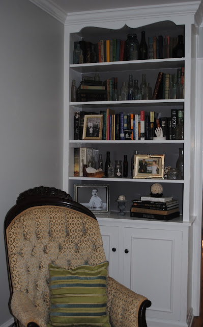
In the living room, we suggested that Sara enhance her already stylish bookcase displays by using the leftover Stone paint on the interior backs of the built-ins. Now her collections really pop.


On the opposite end of the room, we eliminated the red tones that the bricks were introducing into the room by painting them the same Simply White. Now the fireplace wall has that smoky, sophisticated look Sara was seeking.


Sara’s inherited antiques are framed beautifully by some glamorous yet affordable silk dupioni drapery panels in platinum. A pair also hangs in the dining room, connecting the two rooms in an elegant fashion.


Impressively, Sara did most of this styling on her own with only minimal online consulting from us. She just kept playing around with different configurations until she settled on arrangements that work.

Sara still has her wish list: a living room rug, a sleek coffee table, new light fixtures, a hipper kitchen backsplash, but we can all agree that with these budget friendly updates, she’s well on her way to achieving the sophisticated, stylish space she had in mind all along. What do you think?


If you want to truly love where you live, please contact me about design services.